Engagement Dashboard for NLM's OCCS
A Proof of Concept user activity heatmap, cloud service cost panel, and survey feedback analysis for the NLM's Office of Computer and Communications Systems' (OCCS) DailyMed Data Studio dashboard
Presented and Delivered to the OCCS team effective July 22nd, 2026
Case Study: Engagement Dashboard for NLM's OCCS
Background
DailyMed is the National Library of Medicine's official provider of FDA drug labeling — the source of truth that clinicians, pharmacists, developers, and the general public reach for when they need to know exactly what is in a medication and how it is meant to be used. To keep a service of that reach healthy, the NLM's Office of Computer and Communications Systems (OCCS) had built an engagement dashboard tracking user activity and continued engagement over time. That dashboard — including the considerable work of hooking it to a continuously-updated data pipeline through BigQuery — is the work of Adam Korengold, Michael Cumbo, and Gagandeep Samra, and everything described below was built on top of the foundation they laid.
Challenge
The existing dashboard answered how much — active users, sessions, API calls, sessions per user — but not why. There was no feature to inform on what, in particular, initially attracted users to the site, what kept them engaged once they arrived, or what they were unable to find and left without. Just as importantly, there was no view of what exactly was incurring cost from the dashboard itself: which cloud services were being consumed to produce those numbers, how that spend moved month over month, and by how much. Without that, engagement reporting and the budget sustaining it were open questions left without answers.
Solution
Rather than propose changes in the abstract, we built a working Proof of Concept the team could see, click through, and plug straight into their own data pipeline. The approach was to rebuild what OCCS already had, extend it with the three features that were missing, and then migrate the whole thing into the environment they actually work in:
- Replicated the existing dashboard on mock data — every KPI scorecard, trend graph, and top-events table was approximated and simulated with mock data, so that the new panels would appear as close to a true integration as possible without depending on walled-off live NLM data or credentials.
- Added a thermal heatmap spatially representing the pages that users, as a whole, entered and interacted with. Each cluster's size and heat scale with its traffic, turning a ranked list into a one-glance read of where demand is actually concentrated or lacking across the site.
- Added a cost panel identifying which services — BigQuery, Vertex AI, Athena, or others — incurred the greatest cost and in which direction the total cost moved month over month, to ensure for a sustainable dashboard that does not consume more resources than the value it produces.
- Added a voluntary survey widget asking what users came to the site for, whether they found it, and what one change would make DailyMed more useful — with an optional prompt to enter their email so that further discussion regarding actionable insights could be followed up on, rather than guessed at.
- Migrated the mock-up from Vercel into their native Data Studio environment, so OCCS could integrate it, plug their continuously-updated dynamic datapipeline into it, gather the insights the new features are meant to surface, and deliver them to DailyMed to act on.
The Concept
The first build is a live, single-screen web dashboard hosted on Vercel — view the concept dashboard. The familiar panels sit on the left and top; the three new ones are the heatmap, the maintenance-cost card, and the floating feedback widget in the lower right.
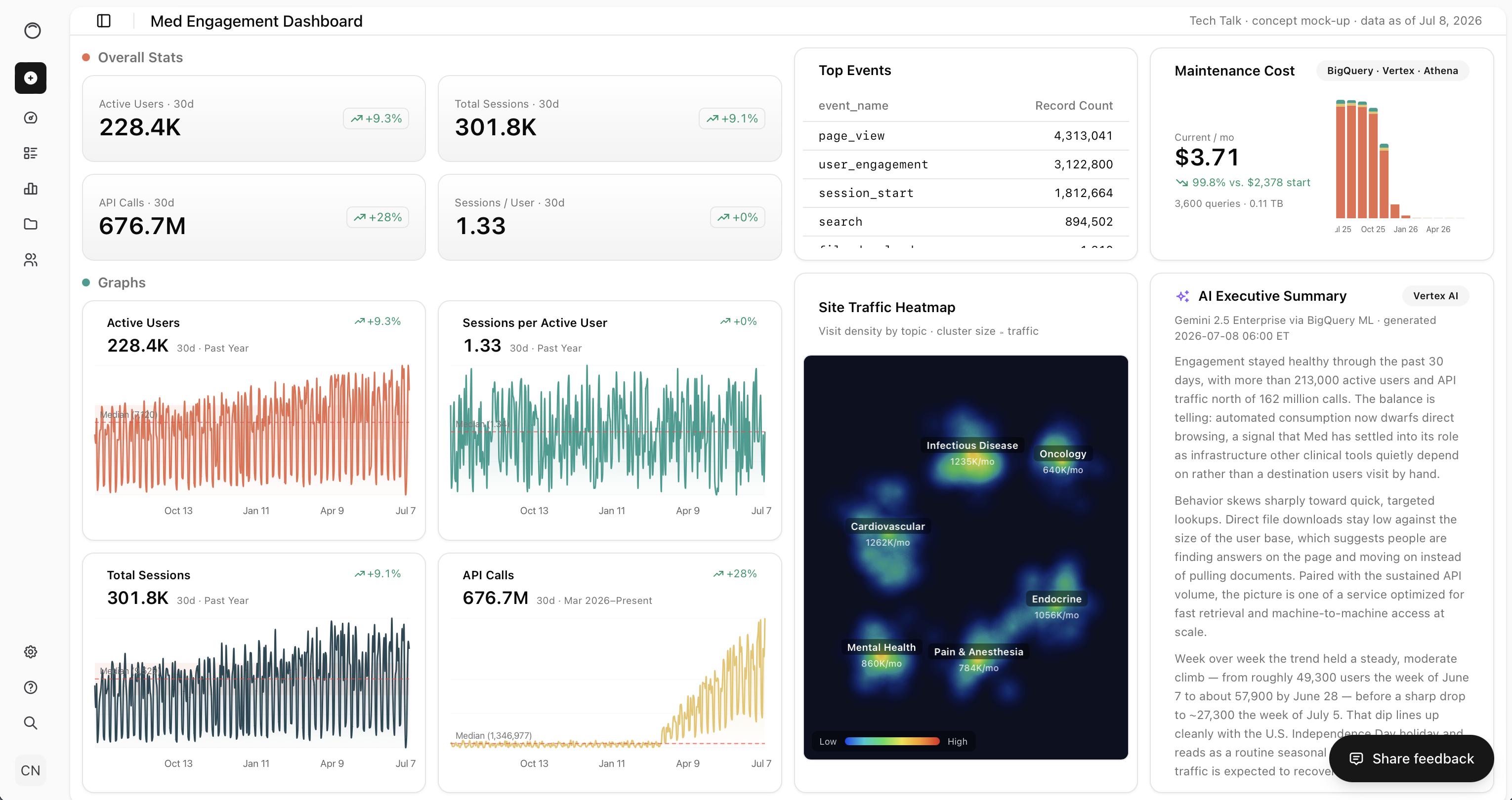
The cost card carries the story the original dashboard could not tell: current monthly spend broken out by BigQuery, Vertex, and Athena, with the twelve-month trajectory beside it — a bill that collapses from thousands of dollars a month to single digits once queries are pre-aggregated and rewritten, and, crucially, a visible attribution of which service was responsible for the difference.
Reading the Heatmap
In the PoC, the heatmap shows six clean, disparate clusters, because it is running on mock data where every page belongs to exactly one clinical category. Plugged into the real-time data pipeline, pages will fall into more than one category at once, so the expectation is spatially visible overlap — the regions where clusters bleed into each other are precisely the mixes that are popular, and the cold space between them are the mixes that are not, or simply under-serviced. Nor is the technique limited to page classification: the same insight could be gathered from displaying the heatmap across authors, departments, and other meta details about the pages the users interact with to get a better picture of how to further serve the needs of DailyMed's users.
The Migration
A dashboard the OCCS team could not plug their own data into is worthless, so the second half of the work was translating the PoC from Vercel into Data Studio — the environment the existing dashboard already runs in. The KPIs, trends, events table, and cost breakdown map onto native components; the thermal heatmap, which no built-in chart type can produce, was shipped as a custom community visualization, so it renders identically once the pipeline's data is fed to it.
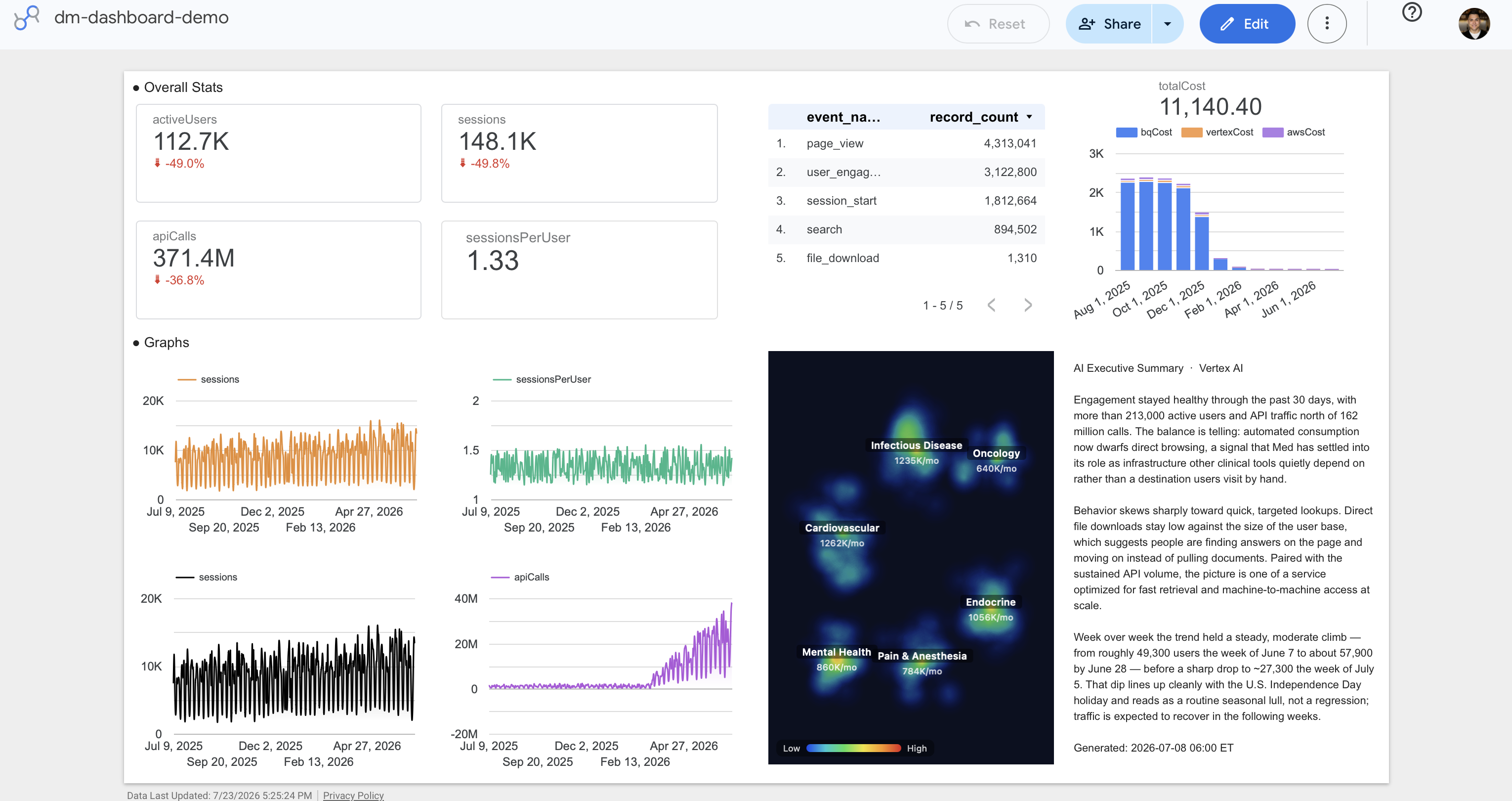
Outcome: A direct plug-and-play PoC delivered in less than two weeks.
We put pen to paper after the first iteration of the OCCS Tech Talk series on July 8th, 2026, built both dashboards within that week, demoed them, and handed the PoC over two weeks later, at the second iteration onJuly 22nd, 2026. What the team received was not simply a set of notes suggesting next steps, but a working artifact — the Vercel concept to show stakeholders what the additions look like in a visually complelling UI, and the Data Studio port ready to be wired into the existing pipeline to display actionable insights and drive the results they're looking for. From there the heatmap, the cost panel, and the survey responses act as a continuous pulse check and standing feed of evidence informing DailyMed about what draws people to their site, what keeps them there, how to act on it, and what it costs to keep the service running. The team continues to develop the dashboard from where we left off, and we're greatly looking forward to seeing how it evolves before final delivery.
Contact Us Today
Have questions regarding our software or services? Reach out to our team and let's discuss how we can help bring your ideas to life.